Trek for Teens Foundation
2022
Branding
Web Design
Context
For almost two years, I volunteered with Trek for Teens Foundation, a charity in Canada that raises funds and awareness for youth experiencing homelessness in Canada. In my early days, I facilitated a rebrand of the organization with another media volunteer. Throughout my time at the charity, I managed all media volunteers, created newsletters and weekly social media content, as well as built and managed the charity's current website.
Logo Redesign
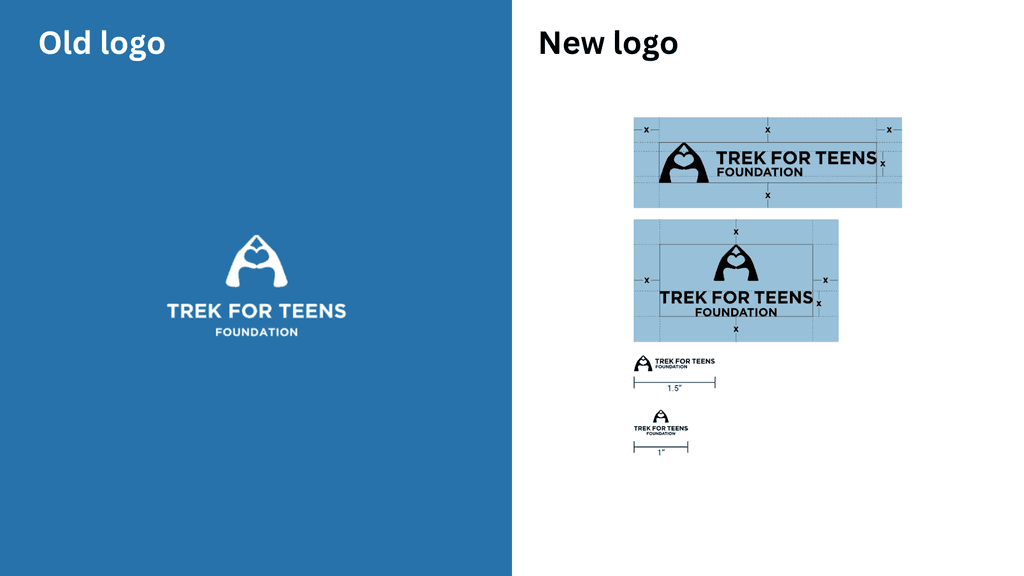
I came on board to help the charity improve their brand assets as they did not fit accessibility guidelines. The first element of the rebrand consisted of a redesigned logo using symmetry and proportions.
Logo transformation
2021
New Colours and Visuals
The brand blue and orange were adjusted to ensure they were contrast accessible with white, achieving a ratio of 7.21:1 and passing all WebAIM accessibility tests. Below are some graphic assets pre and post-rebrand that display a visual transformation. The new graphics follow the design principles of emphasis, balance & alignment, contrast, repetition, proportion, movement, and white space.
Brand transformation
2021
Brand & Writing Standards
After these brand elements were adjusted, I helped create a 50+ page Branding & Writing Standards guidebook so that the different Trek for Teens chapters across Canada present the same cohesive brand.
Brand and Writing Standards
2021
Web Design
Throughout the 2021-2022 academic year, I designed and built a multilingual website using blank pages on Wix. Below is an early site map I created which breaks down the different sections requested by the executive team.
Site map
2021
Published homepage
2021


